02 · Two websites, one company
Cetus
A crypto exchange and a brokerage in Bishkek — two sites that had to look related, not identical.

The task
One company, two businesses: a crypto exchange and a brokerage in Bishkek. The sites had to look related, not identical.
Decisions
01
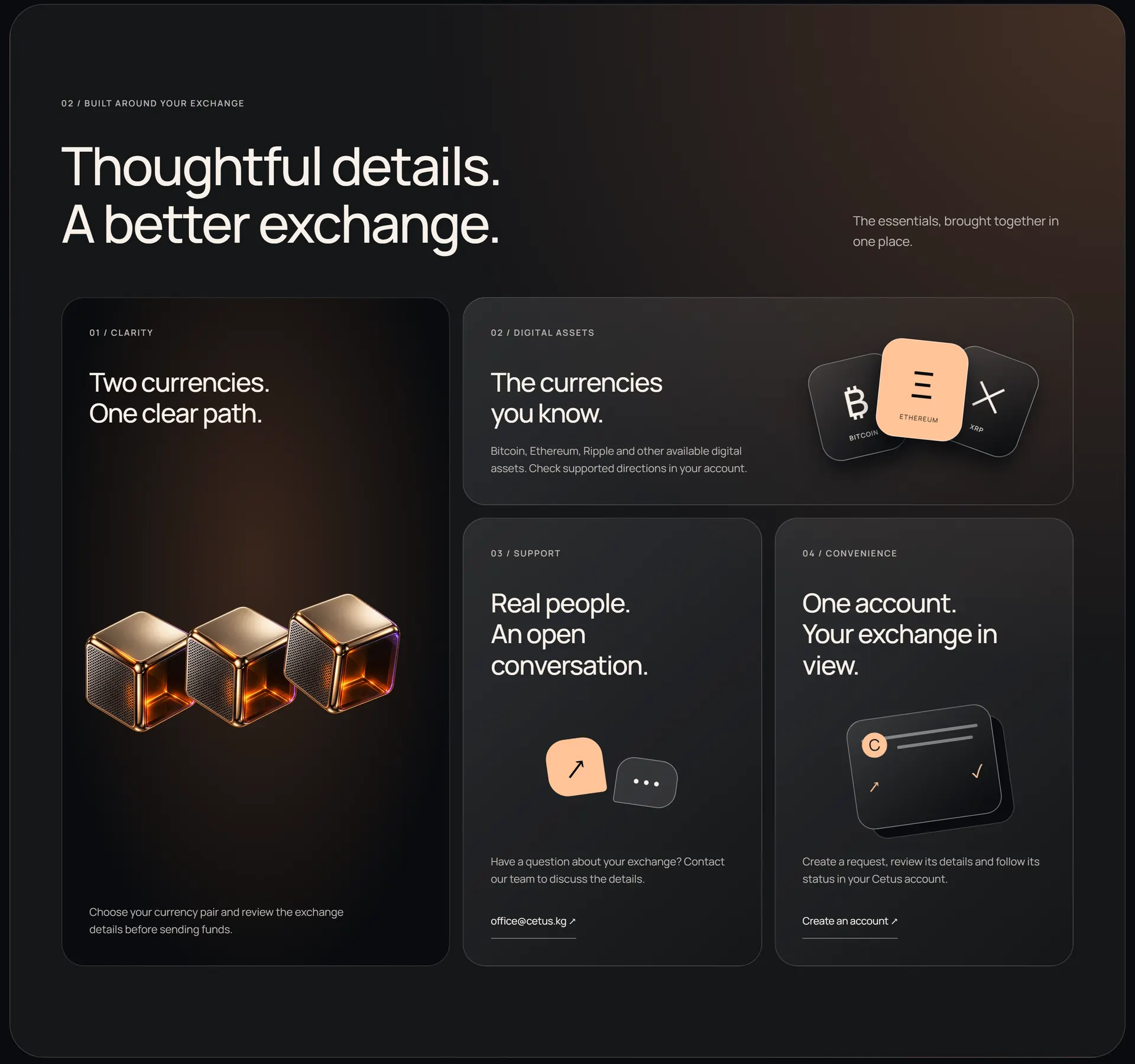
One library of objects
Cubes, coins, a ring — every object shares one material and one light. They do the work stock photographs usually do, and they tie the two sites together without repeating a layout.
02
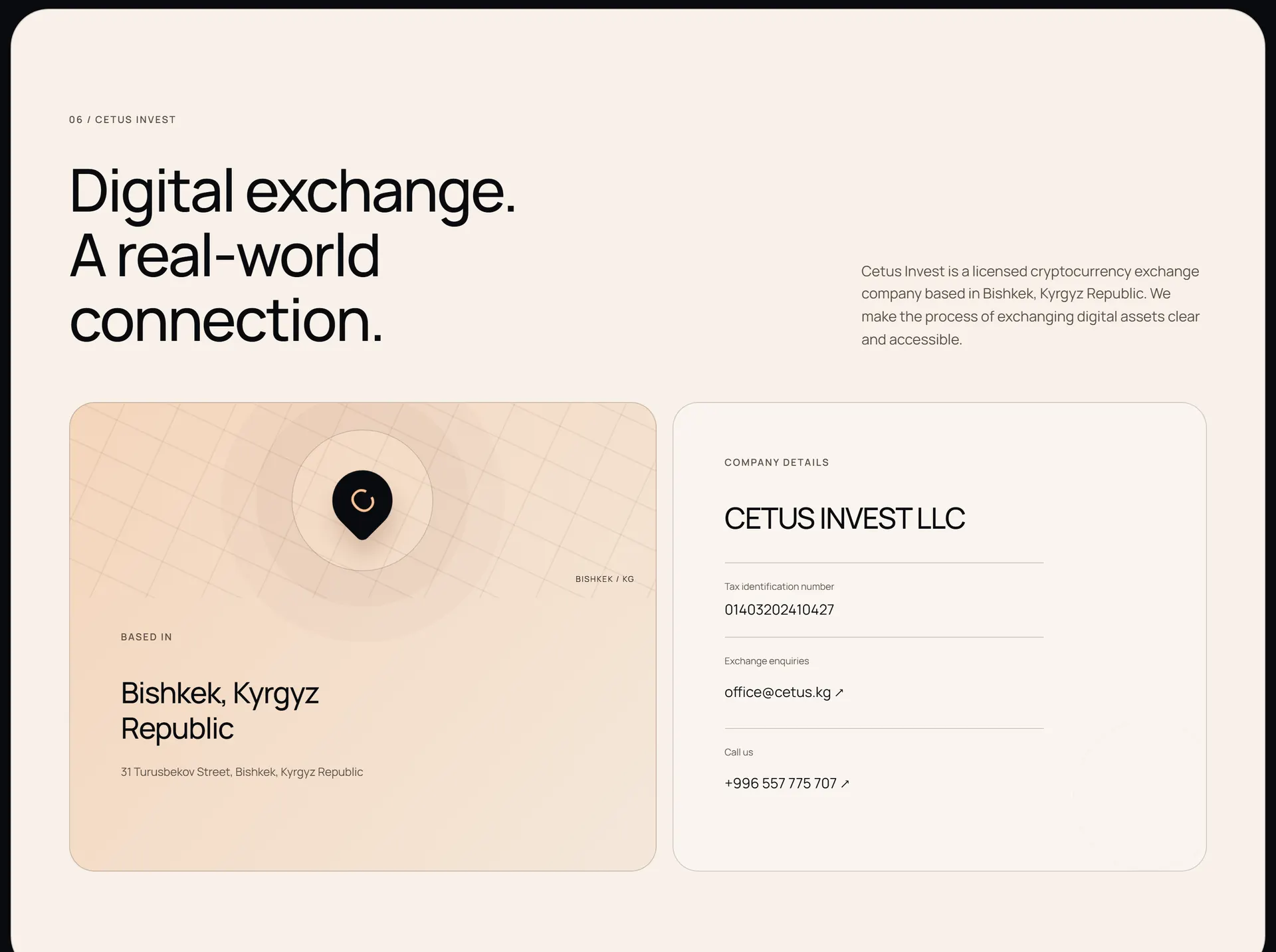
An exchange with an address
A crypto exchange is easier to trust when it stands on a street. The map of Bishkek sits on a paper panel, a light break in a dark site, with the legal entity’s card pinned to it.
03
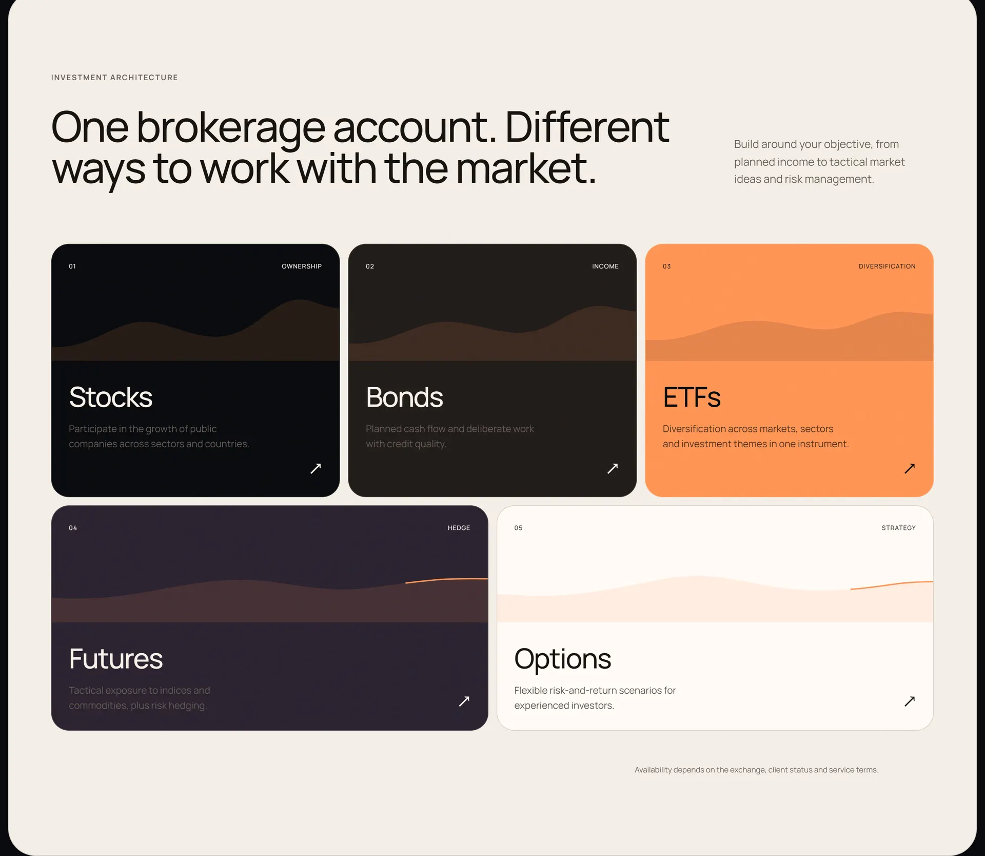
Five instruments, five curves
Stocks, bonds, ETFs, futures, options. Each card gets a line that moves the way the instrument does, instead of five icons from one set.
04
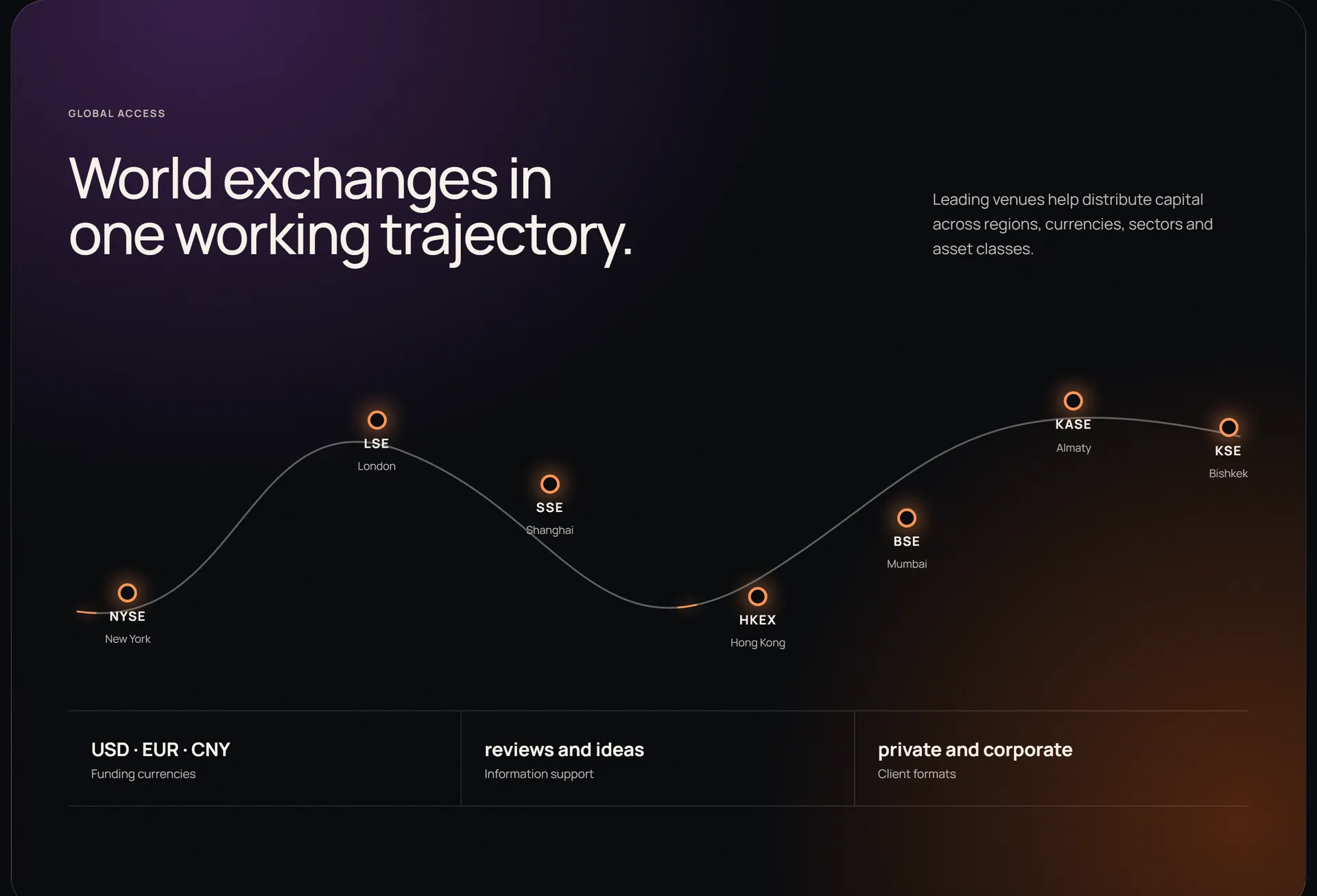
One path through seven exchanges
NYSE, LSE, SSE, HKEX, BSE, KASE, KSE sit on one amber line. Market access is drawn as a route you travel, not a wall of logos.
05
The name as the ground
The last call to action stands on the word CETUS set wider than the screen. The final thing a visitor sees is the name, not a form.
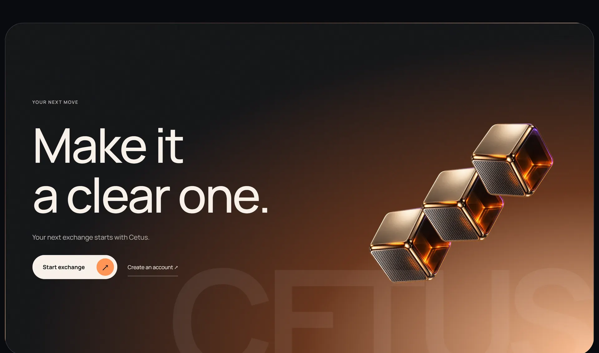


Both sites are written in Russian and English, and the motion can be stopped with a button that is always in view.
Its own system
Same ink, same amber. The exchange leans brown, the brokerage violet.
Palette
Cetus Invest
- ink#090b0e
- ink-soft#151619
- brown#68361e
- amber#ff9454
- amber-light#ffc397
- paper#f8f1e9
Cetus KG
- ink#090b0e
- ink-high#202126
- violet#34233f
- signal#ff9454
- signal-soft#ffc397
- paper#f4eee6
Type
- Manrope
- Both sites, every size
Desk and hand


Where it stands
A redesign. Both sites are up as preview builds.
Let’s build it.
Tell me what you need — I read every message and answer myself.
Or write directly
hello@dmitrydesign.org